

Picking a paint color looks easy. You open a shade card, point at a nice color, and you’re done. At least, that’s what I thought. Then I painted my bedroom twice in one month.
In this guide by Homes Remedy, I’ll share my own painting story, the mistakes I made, and the simple steps I now follow every time I paint a room. By the end, you’ll know how to choose the right colors for your walls and ceiling the first time.
My Story: The Paint Color I Got Wrong
When I decided to repaint my bedroom, I went to the paint shop and flipped through the shade card. I picked a soft gray. On the small paper swatch, it looked calm and modern. For the ceiling, I told the painter to use the same gray. I thought it would make the room look complete.
Two days later, the painter finished, and I walked into a room I didn’t recognize.
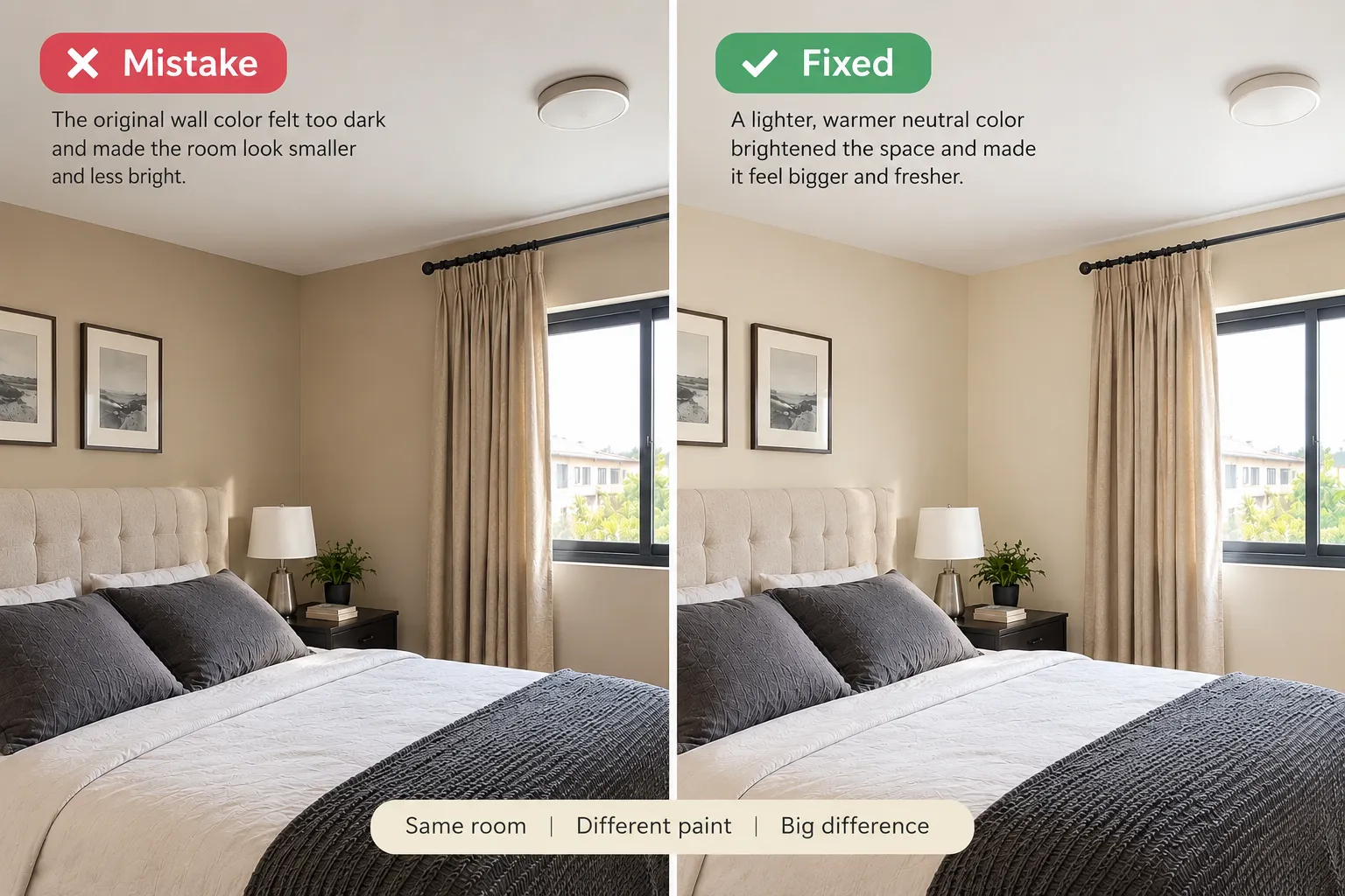
My bedroom has one small window, and it gets very little sunlight. The gray that looked peaceful in the shop turned dull and a little blue on my walls. At night, under my yellow bulb, it looked muddy. The dark ceiling made the room feel short and heavy. It felt like the ceiling was pressing down on me.
I lived with it for a few weeks. I hoped I would get used to it. I never did.
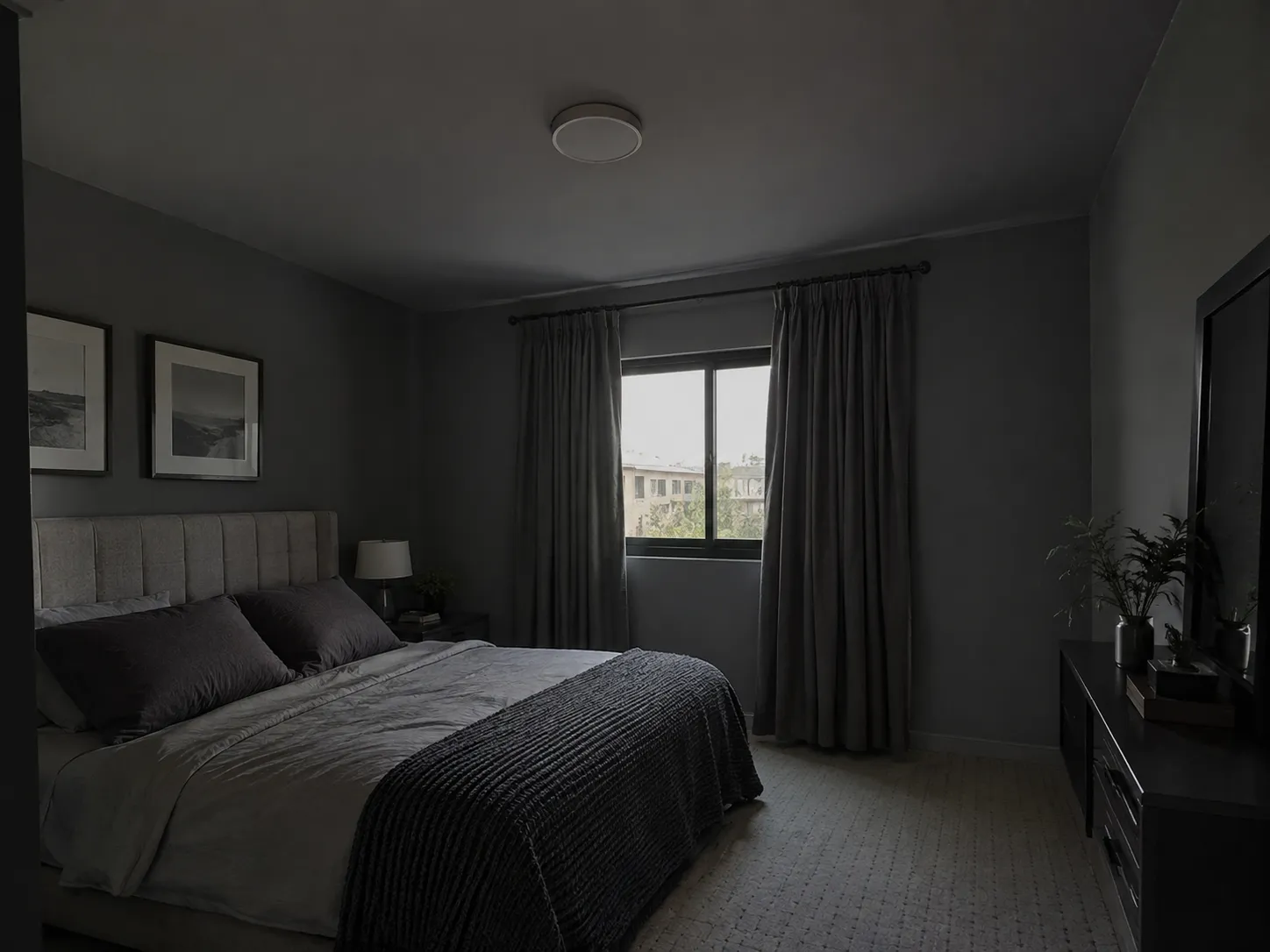
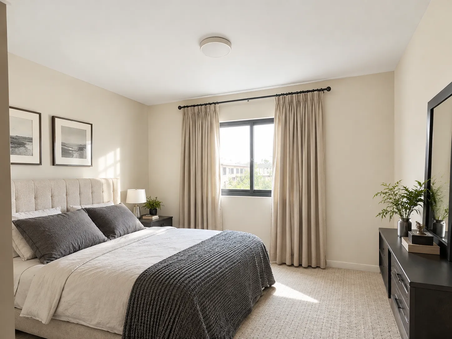
So I painted again. This time, I tested sample colors on the wall first. I chose a warm off-white for the walls and a bright white for the ceiling. The room instantly felt bigger, brighter, and more relaxing.
That second paint job cost me extra money and a few messy days. But it taught me lessons I still use today. Here they are.
Step 1: Check How Much Light Your Room Gets
Light changes how every paint color looks. The same color can look warm in one room and cold in another.
Start by checking which way your windows face:
- North-facing rooms get soft, cool light all day. Cool colors like gray and blue can look cold and dull here. Warm colors like cream, beige, and soft yellow work better.
- South-facing rooms get strong, warm sunlight. Almost any color looks good here. Cool colors can help balance the heat and brightness.
- East-facing rooms get bright light in the morning and darker light in the evening. Test your color at both times.
- West-facing rooms get soft light in the morning and warm, orange light in the evening. Warm colors can look too strong here at sunset.
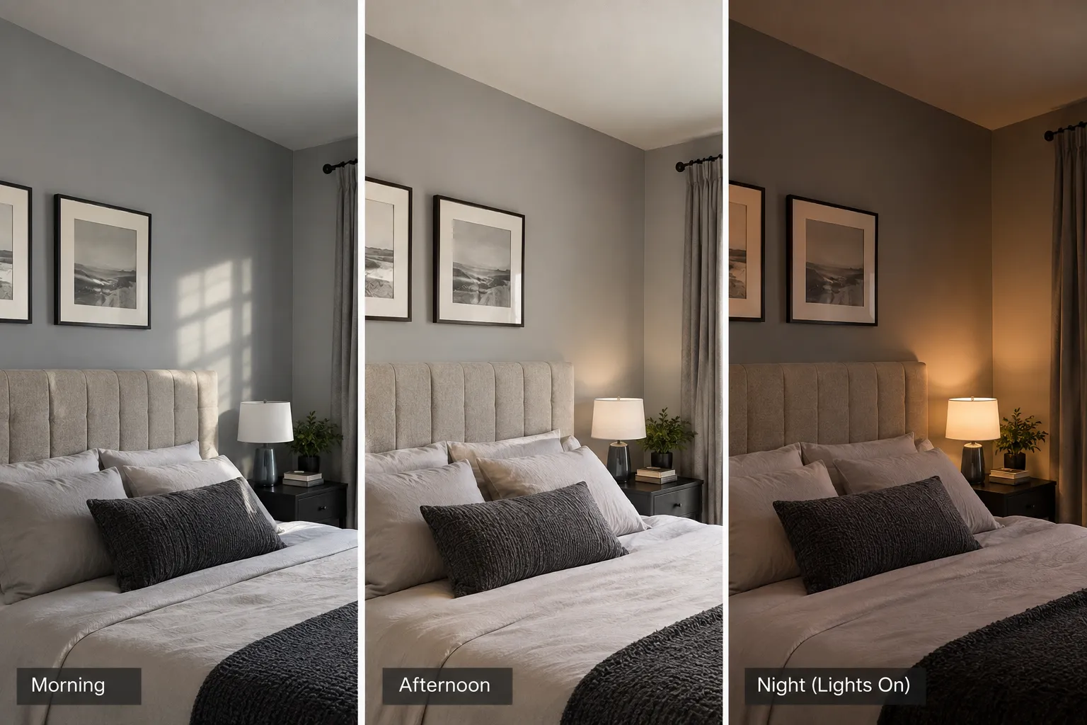
Also check your light bulbs. Warm yellow bulbs make colors look warmer. Cool white bulbs make colors look cooler and brighter.
This was my biggest mistake. My bedroom gets little light, and I chose a cool gray. That’s exactly why it looked so gloomy.
Step 2: Think About How You Use the Room
Every room has a job. Your paint color should help the room do that job.
- Bedrooms need calm, soft colors like light blue, soft green, warm white, or beige.
- Living rooms can handle warmer or bolder colors because people talk, relax, and spend time there together.
- Kitchens look fresh with white, cream, light yellow, or soft green.
- Bathrooms often look clean with white, light gray, or pale blue.
- Study rooms or home offices work well with soft greens and blues, which feel calm and help you focus.
Ask yourself one question: How do I want to feel when I walk into this room? Then choose colors that match that feeling.
Step 3: Look for the Hidden Undertone
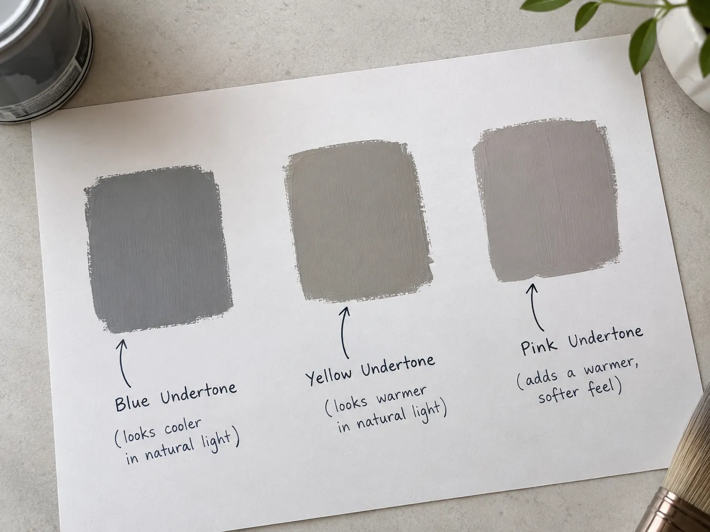
Every paint color has an undertone. An undertone is a hidden color that shows up once the paint is on your wall.
For example:
- A gray can have a blue, green, or purple undertone.
- A white can have a yellow, pink, or blue undertone.
- A beige can have a pink, yellow, or green undertone.
You often can’t see the undertone on a small swatch. It shows up on a big wall.
A simple trick: Hold your color swatch next to a plain white sheet of paper. The white paper helps you see the hidden undertone. If your “gray” suddenly looks slightly blue, that’s the undertone.
My gray had a blue undertone. I didn’t notice it in the shop, but it showed up clearly on my walls.
Step 4: Match Your Walls with Your Floor and Furniture
Your walls don’t stand alone. They share the room with your floor, furniture, curtains, and bedsheets.
Before you choose a color, look at the things you won’t change. If you have a brown wooden floor or a red sofa, pick a wall color that looks good with them.
Many designers use the 60-30-10 rule to keep a room balanced:
- 60% of the room uses the main color (usually the walls).
- 30% uses a second color (furniture, curtains, or rugs).
- 10% uses an accent color (cushions, frames, or small decor).
This rule keeps your room from looking too plain or too busy.
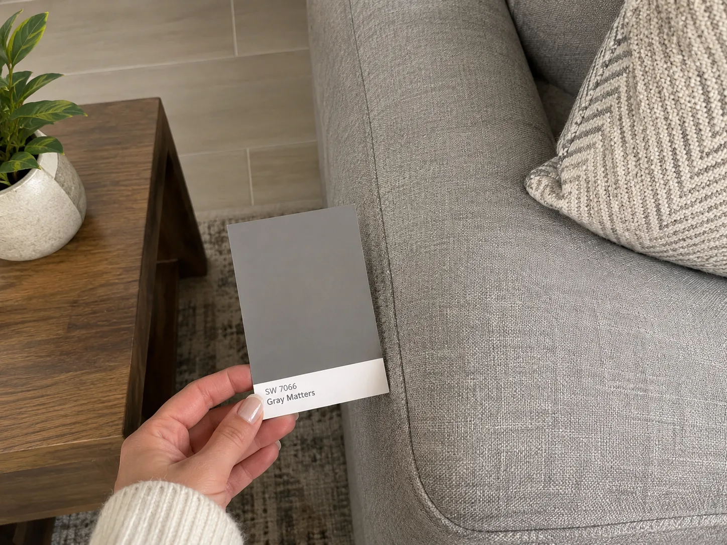
My tip: Take your color swatch home and hold it next to your sofa, floor, and curtains before you buy any paint.
Step 5: Choose the Right Ceiling Color
Most people forget about the ceiling. I did too, and it cost me.
The ceiling color changes how big or small your room feels. Here’s how:
- A white or very light ceiling makes the room feel taller and brighter. This is the safest choice for most rooms.
- A dark ceiling makes the room feel shorter and cozier. It can work in large rooms with high ceilings, but it makes small rooms feel cramped.
- A ceiling slightly lighter than the walls makes the room feel smooth and connected. Many painters mix the wall color with white to get this effect.
- The same color on walls and ceiling can look stylish in some rooms, but only if the color is light.
If your room is small or has a low ceiling, choose a bright white ceiling. That one change made the biggest difference in my bedroom.
Step 6: Pick the Right Paint Finish
The finish is how shiny the paint looks. It affects both looks and cleaning.
- Flat or matte: No shine. It hides wall bumps and cracks well. It’s the best choice for ceilings. It’s harder to clean, though.
- Eggshell: A very soft shine. It’s great for bedrooms and living rooms.
- Satin: A little more shine and easier to clean. It works well in kids’ rooms and hallways.
- Semi-gloss: Shiny and very easy to clean. It’s best for kitchens, bathrooms, doors, and trims.
Remember that shiny paint shows every bump and crack on your wall. If your walls aren’t smooth, choose a flatter finish.
Step 7: Always Test Before You Paint
This is the most important step. I skipped it the first time, and I paid for it.
Here’s how I test colors now:
- Buy small sample tins of two or three colors you like.
- Paint big patches, at least the size of a large book, on two different walls.
- Check the patches in the morning, afternoon, and at night with your lights on.
- Wait at least two days before you decide.
- Pick the color that looks good at every time of day.
A sample tin costs much less than repainting a whole room. Trust me on this one.
Step 8: Keep the Flow Between Rooms
If you can see one room from another, the colors should look good together. You don’t need the same color everywhere, but the colors should feel connected.
A simple way: Choose colors with the same undertone. For example, use warm colors throughout the house or cool colors throughout. This makes your home feel calm and planned.
Common Paint Color Mistakes to Avoid
I made some of these mistakes myself. Learn from them so you don’t have to repeat them.
1. Trusting the shade card. A tiny swatch under shop lights never shows the real color. Always test on your own wall.
2. Ignoring your room’s light. A color that looks great in a sunny room can look dull in a dark one. Check your window direction first.
3. Forgetting the ceiling. A dark or badly matched ceiling can make a room feel small and heavy. Choose the ceiling color as carefully as the wall color.
4. Skipping the sample test. This was my most expensive mistake. Test first, always.
5. Choosing colors before furniture. Paint is cheaper to change than a sofa. Match your walls to your furniture, not the other way around.
6. Picking a trendy color you don’t love. Trends change fast. You live with your walls every day, so choose a color you truly enjoy.
7. Using too many strong colors. Too many bold colors in one room can feel busy and tiring. Follow the 60-30-10 rule.
8. Choosing the wrong finish. A shiny finish on bumpy walls shows every flaw. A flat finish in a kitchen gets dirty fast.
Quick Checklist Before You Buy Paint
Before you go to the paint shop, make sure you can say yes to each of these:
- I know which direction my windows face.
- I know how I want the room to feel.
- I checked the color’s undertone.
- The color looks good with my floor and furniture.
- I chose a ceiling color that fits my room size.
- I picked the right finish for this room.
- I tested samples on my wall for at least two days.
Frequently Asked Questions
Should the ceiling be lighter than the walls?
In most rooms, yes. A lighter ceiling makes the room feel taller and brighter. A bright white ceiling is the safest choice for small rooms.
What is the safest wall color for any room?
Warm whites, soft beiges, and light greige (a mix of gray and beige) work in almost every room. They look good with most furniture and lighting.
Can I paint the ceiling and walls the same color?
Yes, but only with light colors. Dark colors on both walls and ceiling can make a room feel like a box.
How many sample colors should I test?
Test two or three colors. More than that makes it hard to decide.
Why does my paint look different on the wall than on the card?
Your room’s light, the wall size, and the color’s undertone all change how the paint looks. That’s why testing on your own wall matters so much.
Final Thoughts
Choosing a paint color doesn’t need to be stressful. Check your light, think about the room’s purpose, look for undertones, and always test before you paint. Don’t forget the ceiling, because it changes the whole feel of the room.
I learned these lessons the hard way, with two paint jobs and a lot of mess. I hope my story helps you get it right the first time.
Have you ever picked a paint color that looked completely different on your wall? Share your story in the comments. I’d love to hear it.